Cath Davies – Introduction to Branding

Caths lecture showed the importance of knowing how a strong brand identity is created and how the we as designers have a massive influence on the way people behave.

Her main points were that a brand identity is made up of three things;

A brand essence linked to a set of associations which are linked to the brands values and aims. 

Brands are driven by the consumers not the reverse as some might think. We as consumers create the brand essence through the emotional affiliations we create with them. For example feelings, attachments and experiences. This emotional link adds value to the brand and makes the consumer more likely to buy Dr. Martens, for example if they wore them to their first concert, than any other boots. It is this added value that creates the brand identity and makes a brand popular.

Looking forward to my ow branding campaign I think I need to make sure I am fully looking into what the target audience would want from the exhibition I will design. I will also make sure I am questioning the reasoning for my creative decisions like we analysed the Dr. Martens campaign.

1 Day Branding project

We were given an imaginary brand to rebrand in groups, ours was “Craft & Kin” a new barbers shop about to open in Bristol. The two well established barber owners wanted to move away from the hipster aesthetic as they feel like they were blending into the competition. They are an ambitious duo who offer a varied amount of treatments not just haircuts. The company offers quality male grooming services in the heart of Bristols vibrant city.

We started brainstorming ideas about what type of marque we would use but wanted to stay firmly away from the typical imagery associated with barbers; scissors, clippers and so on.  After looking at the definitions of the words craft and king we decided to go with a hand drawn style for the imagery as craft means a task requiring a skill of hand. The idea of the balloon came from the bristol hot air balloon festival, a well known event in bristol. We decided to use this as an emblem for the brand as it represents the companies choice to open their first shop in bristol, and fits with the clients wishes to not have been part of  the hipster aesthetic. As a group we decided to include the white and red stripes to the balloon to link back to the traditional barbers pole as its a very traditional service/ business. We then began working on the deliverables, we chose a price list for the treatments, wall paper for the interior as a way of linking the brand identity to the customer experience. We designed a simple shop front and appointment/ business cards.

Logo – we decided to use the slab serif as it connotes manliness and strength. logo

The wallpaper – shopwallpaper

We decided to move the logo off the page as these pieces would be inside the shop and viewed by people already familiar with the brand so the logo doesn’t need to be so dominant.APPOINTMENT CARDTREATMENT LIST
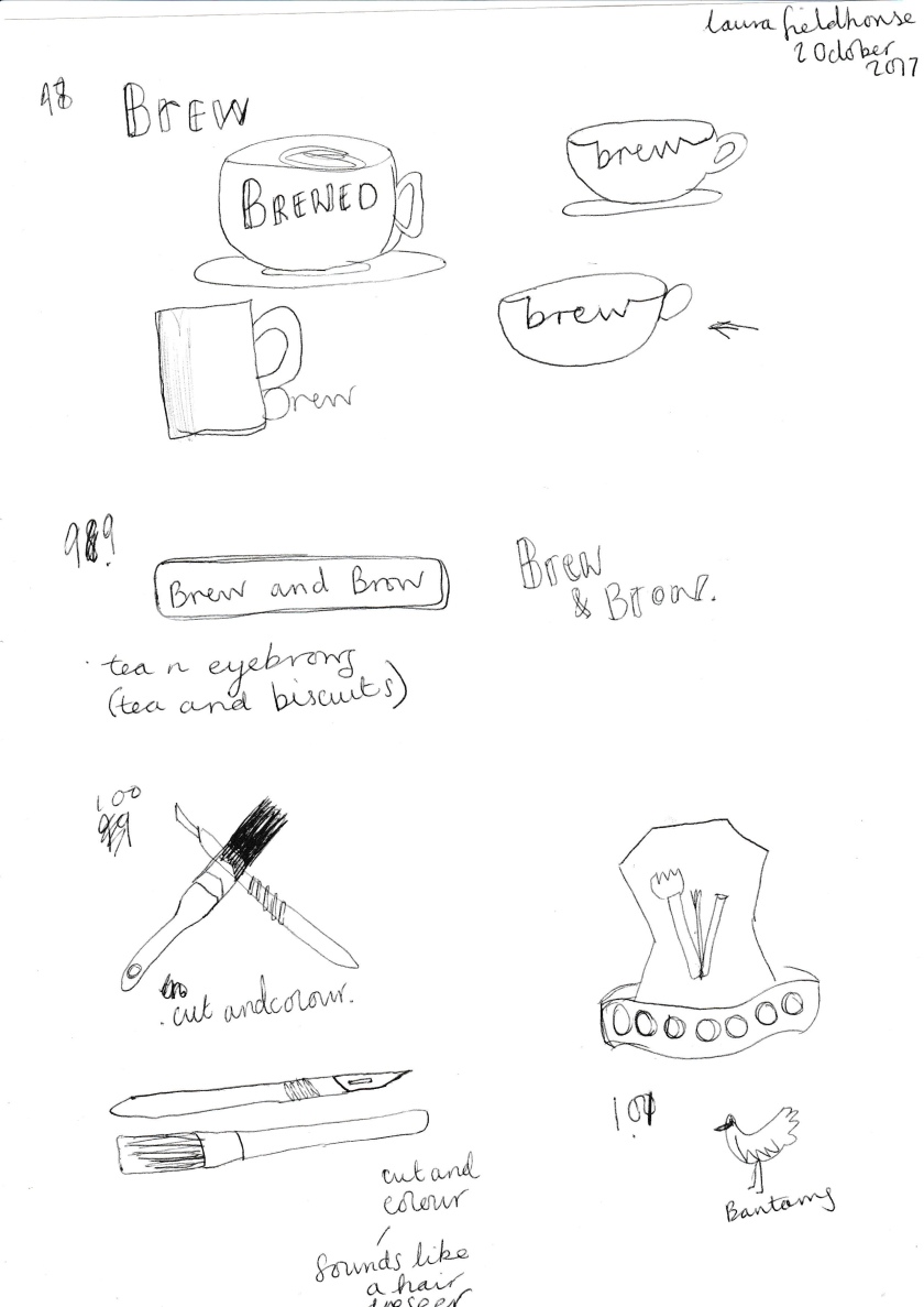
Our idea was to have the image of the logo painted onto the shop front to coincide with the hand made theme of the brand. How much for that balloon in the windowLogo on top

I think the idea we generated was really a good concept but the execution of the visuals and the standard of the work was not of a professional level. I think some of this was to do with the split in the group that happened with around 1 hour of the day left which put the rest of us into a bit of a panic on what was the best course of action to take. At the presentation we ended up with two versions of the same idea, one with the red and white balloon and another two tone variation of the logo. The latter had more of a professional look and was more polished but it was very ‘hipster’ and looked the same as another advertising campaign which was not the brief. Each outcome needed a lot more work but I think the ideation stage of the day went really well in terms of discussions and generating different ideas but the pressure of getting something well executed together got to us as a group so in future I think the thing I have learnt from the project is that planning is key and sticking to time limits and basically the organization and communication aspect of teamwork is really what is important because if it doesn’t the work becomes fractured and out of sync.

To improve I think we really need to go back and really look at the logo and improve its clarity as during the crit it was mistaken for a light bulb which I can see now after looking at it with fresh eyes. The brand was a hard task as trying not to be trendy and hipster with something like a barbers as they are usually fully immersed in what is trendy and current. I think the project needs a lot of refining.

Co-op Brand

Looking at brands with different platforms, as a group we chose the coop and started to research the brands values and images of the brand it its different forms to learn the importance of image, recognizability of the brand and how they show their values. We found that the coop does a lot of work within the community and raising money and also voicing the opinion of people local to their shop. It is owned by its members which strengthens the ideas we had before beginning research that the coop was an organisation cantered on providing local services at a high quality.

The task highlighted the importance of brand identity and how colour and logos are found everywhere to reinforce the identity of a brand – for instance on trolleys, on products and banners even within the coop you will find the brand identity as to be successful it needs to be strong and be constantly reinforced.

We found this information from the co-ops website

“Our promise is: championing a better way of doing business for you and your communities”

The co op is owned by millions of UK consumers and has 3,750 outlets.

Tackling modern slavery
We have a long history of addressing social injustice and supporting workers’ rights. You can read our report on why we’re doing what we can to tackle modern slavery.
Offering employment to survivors of modern slavery

Victims of modern slavery need support to rebuild their lives. In partnership with the charity City Hearts, we have developed our Bright Future programme, which offers a pathway to paid employment for survivors of modern slavery.

Shaping your Community
In September and October the Co-op are holding 20 Shape your Community events across the UK.
They want to hear what people think about the things they should campaign on, what they could do to help.

Campaigning against lonelines
Co-op members and colleagues have raised a huge £6 million to tackle loneliness in communities throughout the UK.

With the money raised, they are funding new British Red Cross services in 39 locations across the UK. These services, developed from the findings from our research, will help up to 12,500 people reconnect with their local communities by providing up to 12 weeks’ support to: build confidence, address practical or psychological barriers help people,
find activities and groups in their local community

We saw the brand identity across these different platforms –

coop.jpg

Dot evaluation of 100 ideas

The evaluation/crit of this weeks work was different to the types of crit we have had in the past, the dot evaluation meant we could see visually which the pieces of work were most popular showing that they were the most successful ones in terms of being professionally executed and communicating something to the audience. It was good to see how my peers had all tackled the project differently and the varied approaches we all took, some using more colour or digital and others using hand drawn and black and white.

For me, the exercise has really helped me in terms of getting back into the right working frame of mind after the summer break and the task being quite challenging really helped me to focus. I have enjoyed experimenting and letting loose with the different types of marks I have used and also making a bit of a mess was a welcome change from working digitally and making sure everything is as clean and crisp as possible.

100 Ideas

1 week project looking at generating ideas as the most-important part of the creative process.

After spending several hours creating different logo concepts I have realised how much I had not been spending enough time during previous projects generating ideas. I think in the past I have been too precious with my ideas and just stuck with one I liked instead of pushing that idea even further to get more and probably better ideas out of it.

The exercise has helped me to really exhaust all off possibilities of one chain of thought which I am definitely going to try and keep up in the rest of my work now.

I tried out lots of different concepts as to not get stuck with doing just initials or variations of the one logo or brand name. I chose to use a lot of different mark making techniques and experimental processes as this is something I like to do within my practice. I think as the time went on it became harder but more worthwhile as it meant I had to really think about who I am as a designer and how I would want people to see my work and what kind of stamp would sum up the way I work.

As a starting point for my 100 marques I changed my initials to geometric shapes and stacked them, leading to the triangle sponge versions still loosely based on my initials. I then moved away from the idea of the initials as I was getting stuck on what to do other than draw an LF. I started using objects around me to print patterns onto the paper; using found objects is something I like to do with in my practice so I thought it would be a good way of representing myself. This lead into the finger print type logos and some very unsuccessful copycat type things that I was just using to try and get my brain going.  I then started to think of the ways other people perceive me and started exploring the idea “fieldmouse” as a play on my surname as in the past I have received post with my name misspelt this way. I worked on some different versions of this on paper and one digitally but I’m not sure it communicates the way I work and who I am effectively or in a way I would like people to see me.

I moved on to thinking about other aspects of my life and myself, my favourite vegetable is broccoli so I started thinking how could this be made more interesting and I came up with the idea of “Brocc & Roll” as a play on “Rock & Roll” which I think shows my sense of humour which I like to try and put into my work. It also feels like quite a fun and interesting brand name that would confuse but intrigue people and the same time. I have spent a while playing around with different ways of presenting the name, more playful and illustrative designs as well as type and image based designs.

I moved onto the “peace n love” phrase coined by Ringo Starr and seen in his YouTube videos instructing fans to stop sending fan mail (favourite video). I tried some different variations on the theme but it seems a bit too feminine and twee for the kind of work I like to produce. Bearing this in mind I went back to the “Brocc & Roll” idea as I think it’s a good representation of my personality.

Another avenue I explored was lo fi as an abbreviation of loz Fieldhouse, loz being an abbreviation of Laura. I tried a few different designs with this and thought one was quite simple and effective and I think it is abstract enough that it indicates some aspect of media or creativity without having to have the word design alongside it. In reflection I think I will try and push this idea in the remaining time left for the project.

1234567891011121314151617